|
__________ TECHNIQUES T T T T T T By Dan Gheno |
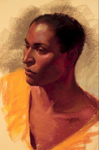 |
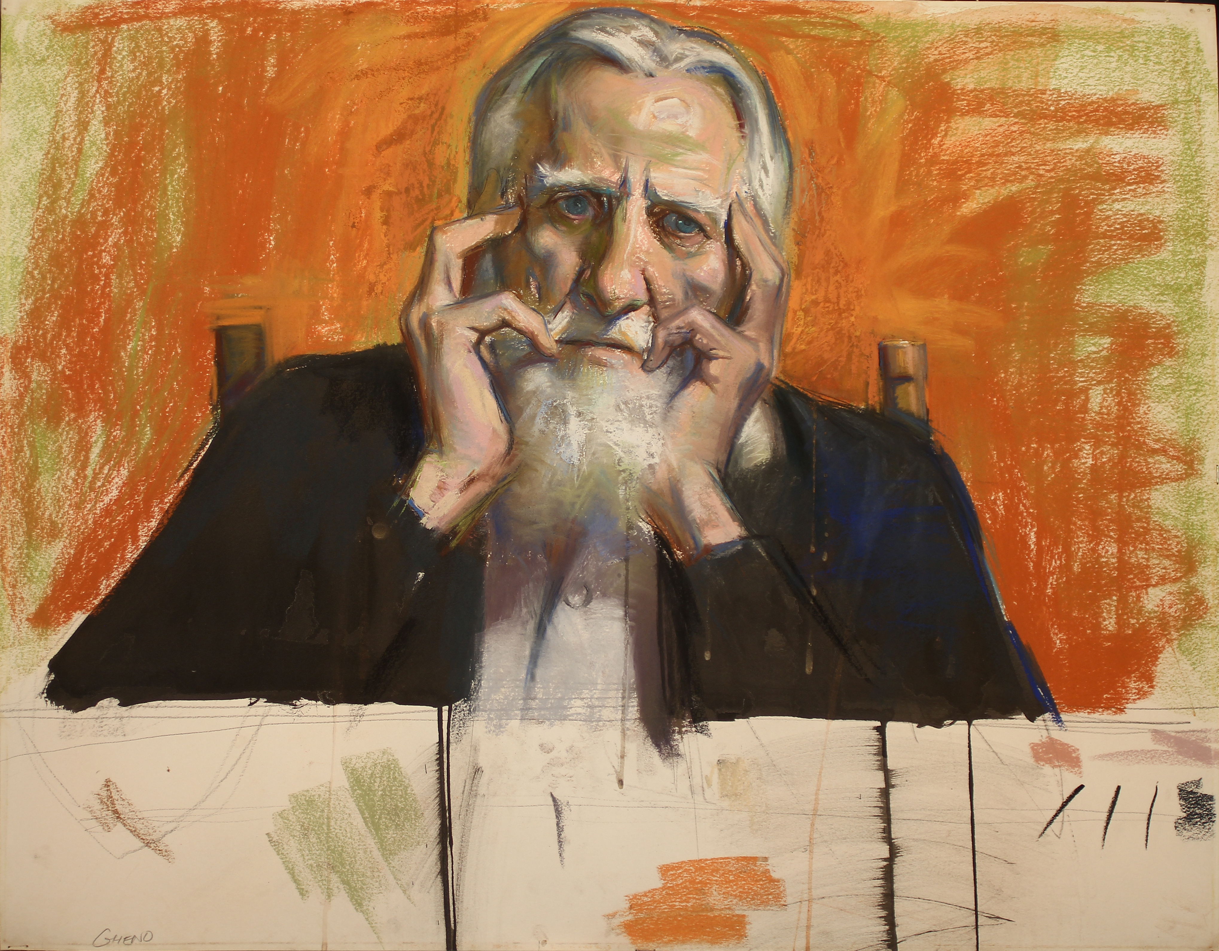
| "PORTRAIT OF JAMES JOHNSON," PASTEL, 18X20 |
|
__________ TECHNIQUES T T T T T T By Dan Gheno |
|
| "PORTRAIT OF JAMES JOHNSON," PASTEL, 18X20 |
Many artists and connoisseurs have a fear of the pastel medium. To the cautious art buyer, the medium is fragile, easily ruined by water, fire and sunlight. To many artists, the medium seems, chalky and lacking in dramatic potential.
In fact, there is no reason why pastels cant last forever, or why the artist can't manipulate them as extensively as any other medium. And there is no reason why the artist can not combine pastels with other mediums for a multitude of effects and expression.
Indeed, I like to begin most of my pastel paintings with an under painting of oils, severely diluted by solvent. Sometimes I use gouache or water color as an under painting. Quite often, I roughly block in the major color and value masses with the broad side of the pastel. Then I work back into the painting with a brush soaked in water. Both the Pastel cloth surface and the gesso-pumice surface are well suited to this technique.
GESSO-PUMICE ON ILLUSTRATION BOARD
I prepare this pastel surface with a mixture of gesso and water mixed with pumice. It is almost impossible to offer an exact formula for this mixture, since all brands of gesso and pumice are different.
 I follow the touch and test
method. I slowly add water into the gesso until it feels like a thin cream. Then
I cautiously add pumice to this mixture, starting with 2 tablespoons to a cup of
gesso/water. I test the mixture on a scrap of board. If the test strip is not
rough enough after it has dried, I add more pumice and test it again. I continue
the process until I'm satisfied.
I follow the touch and test
method. I slowly add water into the gesso until it feels like a thin cream. Then
I cautiously add pumice to this mixture, starting with 2 tablespoons to a cup of
gesso/water. I test the mixture on a scrap of board. If the test strip is not
rough enough after it has dried, I add more pumice and test it again. I continue
the process until I'm satisfied.
You can apply the gesso-pumice mixture in many ways.
If you want an even delicate surface, you must take your time! Dip the tip of your brush into the mixture, and wipe- off any excess globs. Start at the upper left hand corner of the board, make a one inch vertical stroke, and then cross over this patch with another one inch horizontal stroke. Overlap each new patch so that there are no gaps in your surface. Move slowly across your surface, remembering to dip anew into the gesso-pumice mixture for each new patch.
If you want a more textural surface, you can go wild with the gesso-pumice mixture. You can slop on the mixture, moving it in any direction you want. The brush strokes will later show-up as a texture that underlines every pastel stroke you make. Just remember to cover the entire picture surface with the mixture. And don't get too adventurous with the thickness of the mixture. Some pastel brands wont stick when the mixture is too thick.
Avoid the temptation to touch the surface while it is still wet. Your curiosity will not speed up the drying time, but your finger will pull the pumice out of the wet mixture, ruining your surface.
You can add acrylic, water color or ink to the gesso- pumice mixture, if you like working on a toned ground. You can also use the gesso-pumice mixture on almost any archival surface, like museum board, foam core, printmaking paper and masonite.
PASTEL CLOTH
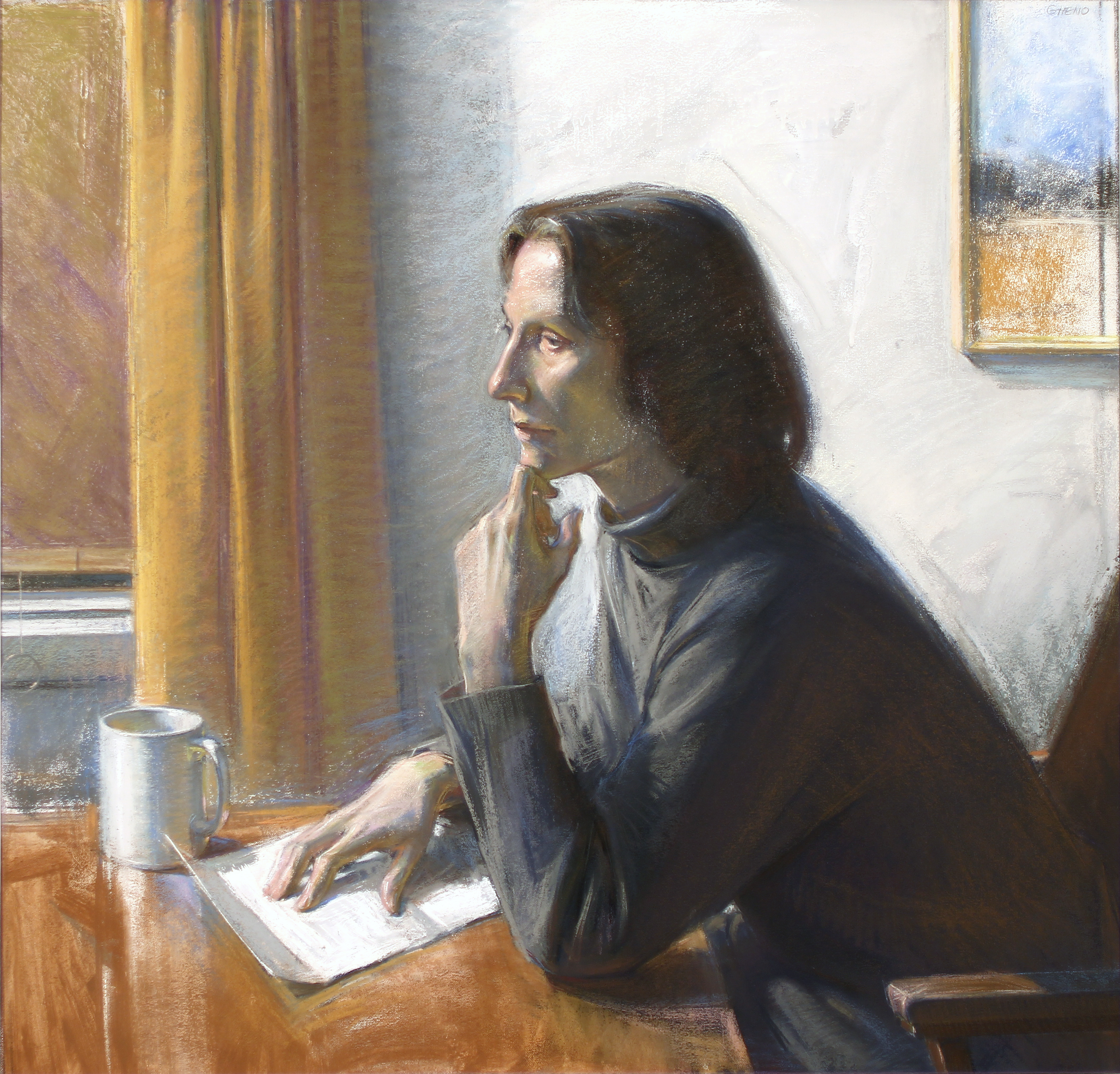
The pastel paintings, "The Call of Home" (below) and "Window" were both rendered on pastel cloth, manufactured by NY Central Art Supplies. The surface is very even, like paper. But the surface grabs onto the pastel like a magnet. You can make revisions over and over if you want, and the surface will never become saturated or bogged down. You can also stretch the cloth like canvas over stretcher bars. Or you can mount the cloth on foam core with pins, tape or glue. As with the illustration board surface, you can also paint back into the pastel image with the gesso pumice mixture to introduce a little paint texture.
 I like using
Nu-Pastels on this absorbent surface. Nu- Pastels is
usually too dry to use exclusively on most surfaces. But with the pastel cloth,
I usually don't need anything softer.
I like using
Nu-Pastels on this absorbent surface. Nu- Pastels is
usually too dry to use exclusively on most surfaces. But with the pastel cloth,
I usually don't need anything softer.
On almost any surface, I like blocking-in most of my shadow areas with Nu-Pastel #244, a neutral, purplish dark. Then I work into the dark with various other colors which are appropriate to the area, like some kind of yellowish ochre or burnt sienna for the shadow flesh colors. I find that #244 helps unify the composition with a constant underlying foundation color. But #244 doesn't kill or muddy the subsequent, overlaid color as much as a black or a brown might. You must still be very diligent in glazing over or covering most of the initial block-in, so that you don't end up with a purple painting.
Pastel cloth allows you to experiment a lot with texture. Looking at the "Window," you can see that I globbed- on the texture onto the book, the dress, background areas, the ledge underneath, and the highlight within the face. I then worked back into the texture with the broad side of the pastel stick. I either then left the pastel strokes in their rough state, or I liquified the pigment, creating a softglaze of color that merely stained the impasto areas.
PRINTMAKING PAPER
I used Rives BFK printmaking paper for the two pastels, "Passion" (below) and "Portrait of James Johnson"(above). I really love this surface. You don't need to prepare the paper in any way before you start pastelling. The unaltered surface allows for velvety soft transitions in color and value. But the paper doesn't allow for any indecision. The paper becomes quickly saturated and wont hold any more pastel pigment after about 2 or 3 layerings. The paper also begins "pilling" (fragments of paper that break away from the surface and roll into small pin-size mounds), if you rub the pastel too much or use an eraser.
If you need to, you can rejuvenate a saturated section of paper with the gesso-pumice mixture. But that will also alter the unified texture of the paper, so you might want to place the mixture in more than one spot to create a compositional balance.
I purposely introduced a mixture of pumice and clear, acrylic matte-medium throughout several areas of "Passion." You will find that I worked the mixture into the forehead and hands to bring out the form of the figure, and I placed it into the background to frame off the head. I also liquified many areas of the pastel, working into areas with a water- soaked brush. I like the contrast of wet, fluid brushstrokes against the dry, scumbled effect of pastel. I sometimes allow the wet paint to drip, to enhance this contrast.
WHY DO PAINTINGS OR PASTELS?
You can only analyze or investigate technique so far, before you also try to put it to use, to make a statement of some sort. As with oils or any other medium, each pastel must have a reason to exist, a thought or emotion to communicate.
I'm very concerned with the "formal" aspects of painting, including rendition of form and color, and the abstract compositional considerations which have been important to all artists back beyond the time of the Greeks. However, like most figurative artists, I'm equally interested in the emotional, psychological, metaphorical and sometimes narrative uses of the medium.
"The Call of Home" is a metaphorical play on the concept that "you can't go home, again." The woman in the image pauses at her letter to home, reflecting upon her past. The picture hanging on the wall behind her represents her homeland. The shuttered window suggests that she may be in anew land that will become and remain her new home.
 With "The Italian Man," My goal
was to depict a man possessed with quiet pride and dignity. My father posed for
this image. He had a very difficult youth, growing up in Italy before WWII. He
was regularly persecuted by other kids because he was born in the U.S. and
because he would not join Mussolini's Fascist youth squad. Finally, the
government tried to arrest him, and it was only through great resolve and hard
work that he surreptitiously found his way to the U.S. embassy, escaped the
country and made his way to America. I hope that some of this sense of
determination comes through in the image.
With "The Italian Man," My goal
was to depict a man possessed with quiet pride and dignity. My father posed for
this image. He had a very difficult youth, growing up in Italy before WWII. He
was regularly persecuted by other kids because he was born in the U.S. and
because he would not join Mussolini's Fascist youth squad. Finally, the
government tried to arrest him, and it was only through great resolve and hard
work that he surreptitiously found his way to the U.S. embassy, escaped the
country and made his way to America. I hope that some of this sense of
determination comes through in the image.
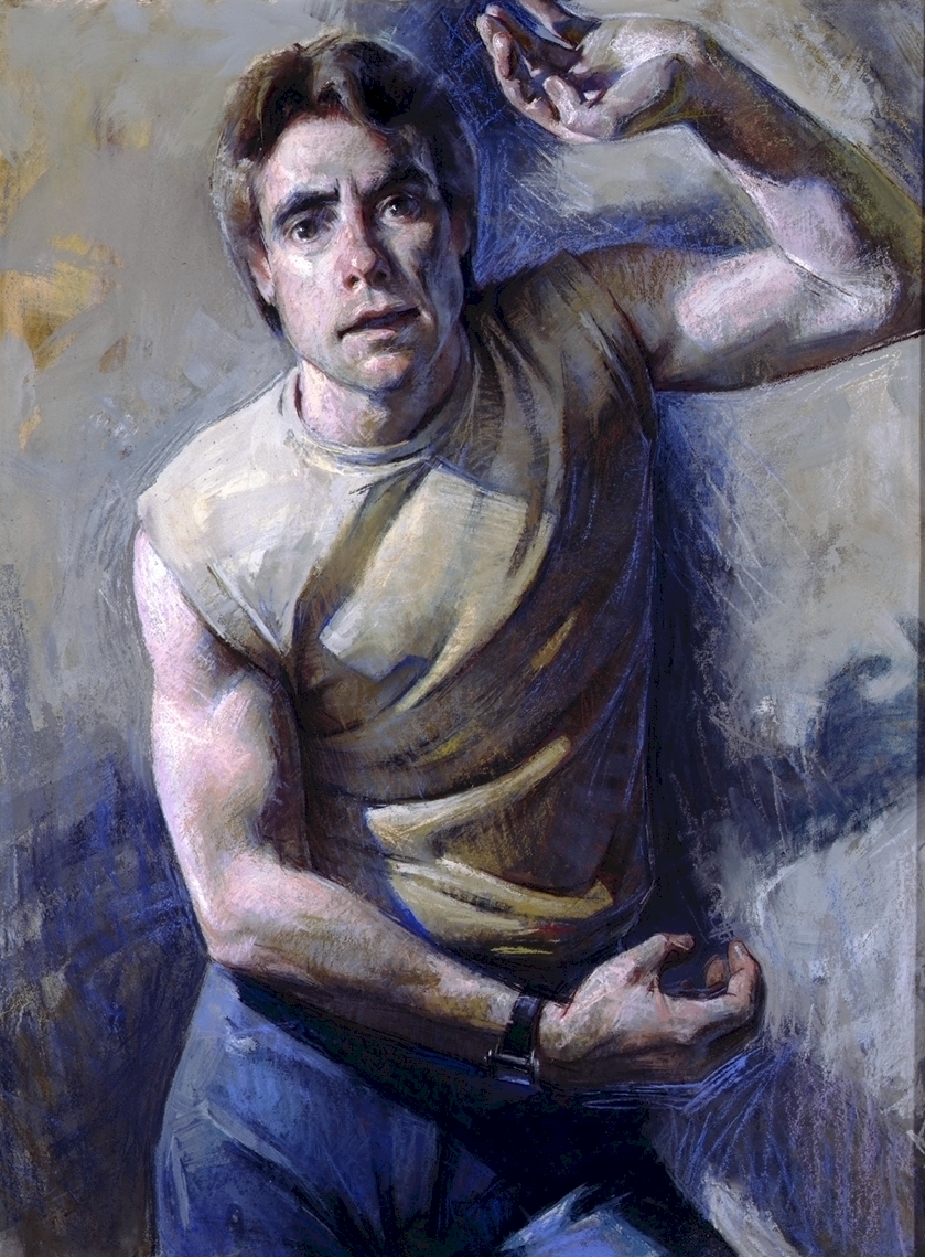
The pastel "Sentry" gets its title from the word sentry as in Roman Sentry or guard. I was trying to depict the tension and anxiety, that we often feel when we are in a state of readiness. My intent was to show a psychology of tension and4 angst with "Passion." I hope the dripping paint and large, empty void below the figure add to a sense of unease.
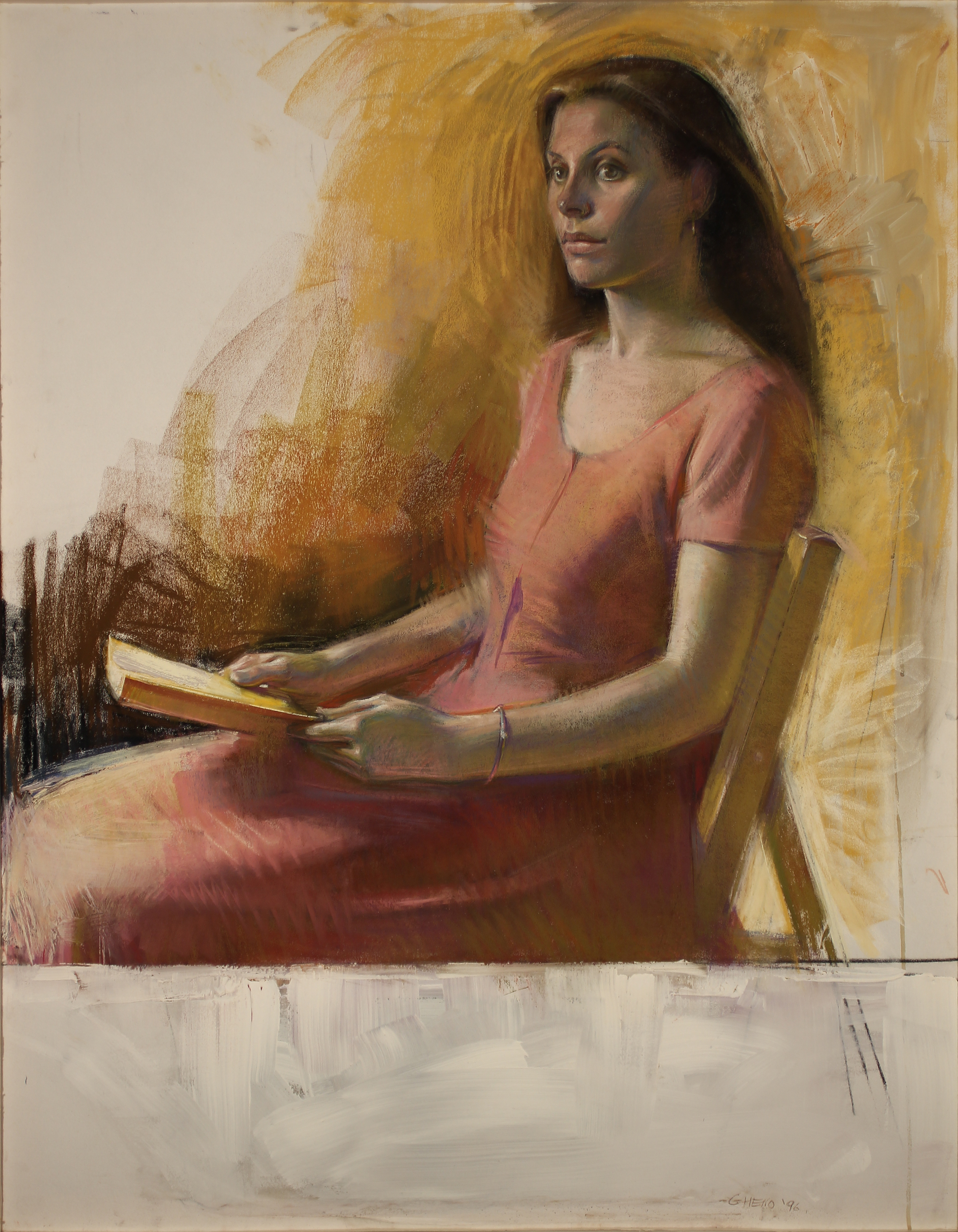 With "Window" I was attempting to
depict that intense glare that some people show in their eyes, when they first
look up from their reading. I owe my inspiration for this painting to the many
renaissance and baroque paintings of a similar motif. I've always been
fascinated by the many portraits of these two periods, where the sitter is
looking up from a book, gazing intently over his or her shoulder. Quite often
the sitter is depicted sandwiched between a foreground and a background window.
With "Window" I was attempting to
depict that intense glare that some people show in their eyes, when they first
look up from their reading. I owe my inspiration for this painting to the many
renaissance and baroque paintings of a similar motif. I've always been
fascinated by the many portraits of these two periods, where the sitter is
looking up from a book, gazing intently over his or her shoulder. Quite often
the sitter is depicted sandwiched between a foreground and a background window.
I have painted my widows in a abstracted manner. The background window is empty pastel cloth. The foreground window ledge below the woman is painted with very thick gesso, piled on with an inexpensive, 2 inch house painting brush.
As you can see, I sometimes try to fuse various artistic sensibilities into one image as I tried to do with "Window" and "Passion." I consider myself a traditional figurative artist. I place an emphasis on structure, form and spatial atmosphere in my own work, but I also feel that the artists of the 50's and their expressive lexicon are apart of our Western artistic heritage and tradition now.
After several centuries of use, The medium of pastels is still also considered a recent addition to the Western tradition. But although the medium is fragile to the touch, pastel images can easily survive for thousands of years, if protected under glass. And if well thought out, pastels, like any other medium, can communicate emotions and ideas to our descendants for the same number of years.
|
||||||