High Technology Humanized in Bayer’s Retrospective
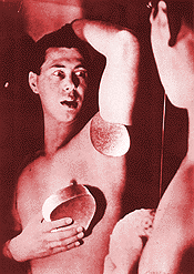
Bayer: "Self-Portrait in Mirror"
(Originally published in The Santa Barbara News and Review: 5/13/77By Dan Gheno
High Technology Humanized in Bayer’s Retrospective
Bayer: "Self-Portrait in Mirror"
(Originally published in The Santa Barbara News and Review: 5/13/77By Dan Gheno
"Do Not Touch!"
That phrase appears often in museums — especially in the present offering of Bauhaus artist Herbert Bayer, in retrospective at the SB Museum of Art.
The wild, ever-changing reflections found in Bayer’s metal sculpture almost dare you to touch. How else could you tell whether or not they are alive and active?
Some of his large scale sculptures do come alive. "Kaleidoscreen," a massive, mechanically movable sculpture which is now in Aspen, Colorado, is represented by photographs and a commentary. As in his other large works in Mexico, Aspen Valley, Los Angeles and elsewhere, the geometric components interact in a seemingly autonomous kinetic ballet.
The classical Greek sculptors, who tried ceaselessly to give their idealized figures a sense of impending motion and human viability, would blush with envy. However, most traditional artists would resent his blatant use of technology, even for such a worthwhile purpose.
Bauhaus Movement
Walter Gropius tried to change this attitude when he founded the German Bauhaus movement within months of the close of World War I. Before the Nazis closed the school in 1932, Bayer as well as other artists like Kandinsky, Albers and Feininger had already convincingly demonstrated that hyper-technology could sometimes be humanized. Mass production items could have an aesthetic value as well as a functional one.
Conspicuous by their longish hair and their lifestyles, visually similar to today’s so-called hippies, the Bauhaus artists couldn’t escape persecution, even when they disbanded. So, along with Gropius who initiated a new Bauhaus in Chicago, Bayer and the rest found asylum in America and Russia.
At the time, Bayer was primarily interested in typography and graphic design. He found a ready audience for his visionary work, when he became art director for a New York ad agency in 1938. Among other innovations, he popularized the ragged right margins in magazine layout and advertising.
The exhibition systematically explains, through commentary and example, how he also helped to re-design the visual appearance of our alphabet. He shunned the "archaic" Roman typography, feeling it had no place in an age when more writing is machine written than handwritten. His geometric, machine-like styles are adopted almost universally now, with their sharp-edged clarity, which often increases comprehension.
lower case
He destroys all of his gains, however, when he insists on using all lower case letters in his work. He claims the eyes comprehend more quickly when they don’t have to differentiate between capital and lower case letters.
Instead, the eye is retarded. Periods lose their importance when not followed by capitals, and separate sentences become lost in a maze of letters. It’s hard to recognize proper names, and with no variety in the typeface, it’s difficult to find reference points when trying to locate particular information.
In another visionary project, Bayer created a new universal alphabet. Bayer feels that our present 26 letter Roman alphabet will eventually go the way of Roman numerals. He threw away some letters and he also formed some entirely new letters as phonetic symbols of familiar work groupings like "ing" and "ed."
In his 77 long and full years, he has helped create a new artistic atmosphere in which multinational corporations have replaced the church as cultural benefactors. Yet Bayer’s large work, not possible without prodigious financing, seems to maintain an ambiance, a neutrality. The only question that remains is the morality — or the inequity of giving so much money to one artist while giving so little to many needy artists.
No one can blame Bayer for his versatility, and no one could expect him to limit his explorations to one field. Among other things, he once did a comic strip for the Chicago Tribune, created numerous new architectural idioms, invented a new type of World Atlas, and he painted enough canvases to cover three galleries in the Museum, a massive display at the Arco Center for the Arts is L.A., the walls of his own home and still more in storage.
His paintings seem to compensate for his amoral, neutral corporate Work. Looking quite innocuous, his bigger and more recent canvases are simple color gradation studies, which all art students do in their first color and design class. But the canvases lose their innocence, when you let them fill your entire field of vision. They engulf you menacingly like a rush of ocean. Your eyes become two pipes —the color flows into your mind, immersing your psyche with a terrifying sense of enslavement and retinal fatigue.
If such a rudimentary technology as brush and paint can be so compelling, think what advanced technology does to us every day. It has isolated us from our environment. We drive our cars, pay our bills in drive-up counters, we talk on the phone and we watch our television sets.
That sign, "Do Not Touch," is very apparent these days —especially outside a museum.
| REVIEW #7 | REVIEW #8 | REVIEW #9 | REVIEW # 10 | |
| REVIEW #12 | REVIEW #13 | REVIEW #14 | REVIEW #15 | |