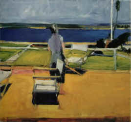
"Figure on the Porch" uses traditional compositional
devices to force the viewer’s eye across the canvas.
Diebenkorn Gets Warm Welcome in L.A. Show
(Originally published in The Santa Barbara News and
Review, Circa 1977)

"Figure on the Porch" uses
traditional compositional
devices to force the viewer’s eye across the canvas.
By Dan Gheno
The body heat was almost overwhelming. But over 350 people stood firm in the cramped gallery space waiting for the senior curator of modern art at the Los Angeles County Art Museum, Maurice Tuchman, to give a special lecture on the Richard Diebenkorn retrospective, in place through Sept. 25.
In contrast to the cool reception Diebenkorn’s work receives on the East Coast, 1200 people visited the showing on opening day. Tuchman, who had expected an informal crowd of about 30 or 35 people for his talk, explained that Diebenkorn nearly found acceptance back east with his early abstract expressionistic paintings.
But, said Tuchman, "Diebenkorn was shrewd about knowing when to leave town." Rather than allowing himself to fall prey to commercially tempting "formula thinking," he moved into representational imagery in 1955. When he felt that complacency was setting back in again in 1967, Diebenkorn returned again to a personal mode of abstraction.
In California, he’s probably best known for the newer abstractions he calls the "Ocean Park" series, numbered from one to 94. These are immense canvases, some twice the height of a human, and impressive if only for the amount of energy needed to swing a stroke across the entire length of the picture. The colors are saturated with white paint, duplicating the sunny, bleached landscape outside Diebenkorn’s Santa Monica studio window.
It’s helpful to compare the realistic drawings of his window view with his finished paintings. In the sharply angled roofs that swing into the distance with a staggered motion, one can see the pyramid shapes in his Ocean Park series. They seem to stack up one on top of another, melodically leading the eye toward one end of the canvas, only to be snapped back to the other side by yet another geometric element.
Diebenkorn’s "trick" is not to lure you with representational empathetic imagery. He holds our eyes to the canvas with arbitrary design elements that are as old as art itself. We are usually led into the canvas by wild, often subliminal diagonals which guide our eyes through the other, more sedate, interlocking shapes. He maximizes the use of repetition, to make our eyes jump to and from the familiar, while passing through the unfamiliar.
"I have always been a landscape artist," said Diebenkorn, who uses traditional landscape elements to give "organic" structure to the formal, clinical elements of his abstractions. Now, as in his early work, he tends to compress the smaller, more complex shapes near the top, while freeing the lower canvas for larger, more ponderous shapes.
The psychological effects of gravity make it difficult for us to accept a large shape that’s too high on the canvas. Our unconscious awareness of landscape perspective makes large objects seem acceptably small near the top of our visual field. That’s why large shapes, placed high, seem disproportionate and too dominant.
Giving equal importance to all sides of the canvas, as Diebenkorn does, is a special interest of modern day art, as evidenced by the minimalists, who seek to simplify or dc-emphasize imagery so the flatness and the integrity of the canvas are reaffirmed. Unfairly, Diebenkorn has been ostracized from this school, but when we reduce his complex color statements to black and white, as in the catalogue repros, the linear articulations come to the fore, isolating his shapes in outlines, like formless puzzle pieces.
Although Diebenkorn’s pictures seem to disappear in reproduction, his original paintings are not so unimaginatively clinical. They have a continuity of universal, human experience we can all -enjoy, as best seen in his figurative paintings.
"It’s as though Dick has absorbed the entirety of all visual history." said Tuchman. In ‘Figure on Porch,’ we see a great influence from Edward Hopper, placing a solitary figure within a big, barren landscape. The woman is anonymous, merely a part of the total design, as we often see in Matisse’s work, which Diebenkorn greatly admires and frequently studies. In kindred with Cezanne, the general thrust of the composition leads us into a collision course with the frame that defines the flat reality of the canvas.
In Diebenkorn, I see the assimilation of countless unrelated, past artists in constant dialogue within his mind. Painting is not a sequential process for Richard Diebenkorn, with one idea following another. Rather, it’s simultaneous, with one idea feeding off another, an expanding, contracting process.
His painting is really no more than a
mirror of this dialogue. He always signs his work "R.D.," a
self-effacing practice which shows the importance he places on process over the
product. This, more than his hatred of trends, separates him from the commercial
art centers of the east.
| REVIEW #7 | REVIEW #8 | REVIEW #9 | REVIEW # 10 | |
| REVIEW #12 | REVIEW #13 | REVIEW #14 | REVIEW #15 | |